The Art of Typography: Choosing the Right Fonts to Elevate Your Design
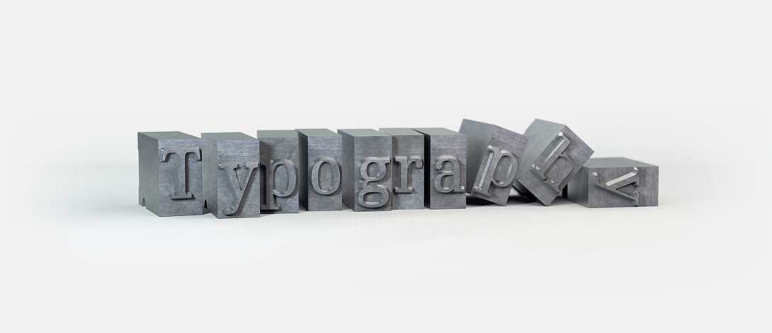
Typography is more than just selecting a font; it’s an essential art form that shapes the look, feel, and readability of any design. From logos to websites and print layouts, typography plays a central role in conveying a message and creating an emotional response. Learn how to make smart font choices, key principles of typography, and tips for pairing fonts to create designs that stand out.
Understanding the Basics of Typography
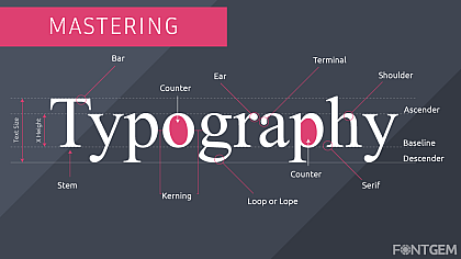
Typography is the craft of arranging text to make it both visually appealing and easy to read. It encompasses everything from font style, weight, and size to line spacing and alignment. Understanding the fundamentals of typography can greatly enhance your ability to create designs that are both aesthetically pleasing and functional.
There are three primary font categories to consider:
-
Serif Fonts: Known for their small, decorative strokes at the ends of letters, serif fonts convey a sense of tradition and authority. Commonly used in print, they’re ideal for long-form content like books and magazines.
-
Sans-Serif Fonts: With a clean and modern look, sans-serif fonts lack the decorative strokes seen in serifs. These fonts work well for digital media and are often used in minimalist designs for a sleek and contemporary feel.
-
Script Fonts: Mimicking handwriting, script fonts are more decorative and can add personality and elegance to a design. However, they should be used sparingly to avoid overwhelming the reader.
Choosing Fonts That Align with Your Brand
Every font has a personality, and it’s crucial to choose fonts that reflect the tone and values of your brand. For instance, a financial company might opt for a traditional serif font to project trustworthiness and professionalism, while a tech startup might choose a modern sans-serif font to emphasize innovation.
Consider the purpose of your design and the message you want to communicate. Is it playful or serious? Elegant or casual? The right typography choice will support these attributes, making your design memorable and effective.
The Importance of Readability
While aesthetics are important, readability should always be a top priority. A beautiful font loses its appeal if it’s difficult to read. When selecting fonts, especially for body text, look for ones with clear letterforms, sufficient line spacing, and appropriate sizing for the intended medium.
For digital platforms, sans-serif fonts are often preferred for their clean lines, which display well on screens. Meanwhile, serif fonts work well in print and give the text a more formal and structured look.
Pairing Fonts Like a Pro
Pairing fonts can be challenging, but when done right, it can add depth and interest to your design. The key is to select fonts that complement each other without competing for attention. Here are a few tips for successful font pairing:
-
Use Contrast: Pairing a bold serif font with a light sans-serif font creates a balanced contrast that enhances readability and draws the eye to key areas.
-
Stick to Two or Three Fonts: Too many fonts can create visual clutter. Limiting your selection to two or three fonts—typically one for headings, one for body text, and an optional accent font—keeps the design cohesive.
-
Choose Fonts with Similar Proportions: Fonts with similar letter proportions and x-heights often look harmonious together, creating a unified look.
Typography and Visual Hierarchy

Typography plays a vital role in establishing a visual hierarchy, guiding the reader’s eye through the design. By varying font sizes, weights, and styles, you can emphasize important information and lead viewers from one section to another seamlessly.
For example, bold, large headings can grab attention, while smaller, lighter text can provide details without overpowering the layout. Using colour and spacing also helps to organize text, making the design more engaging and easier to follow.
Experimenting with Typography in Digital Design
Digital platforms offer a playground for experimenting with typography in creative ways. Variable fonts, which allow designers to adjust weight, width, and slant within a single font family, are growing in popularity for their flexibility. This approach gives designers more control over how text appears across different devices, improving both aesthetics and functionality.
When crafting digital content, writers and designers may also need tools to refine their text and ensure clarity. A helpful tool, such as an AI-powered paraphrasing tool, can assist in adjusting tone or rewording phrases to align perfectly with the design’s chosen typography style. This can be especially useful for maintaining consistency in brand voice and ensuring that text fits neatly within design constraints.
Typography Trends to Watch
Typography is continually evolving, and staying updated with the latest trends can add a fresh and modern feel to your designs. Here are a few typography trends to consider:
-
Variable Fonts: Allowing for more customization, variable fonts provide dynamic options that are especially useful in responsive web design.
-
Minimalist Fonts: Clean, minimalist fonts are popular in contemporary design as they offer clarity and focus, helping brands convey messages with simplicity and elegance.
-
Bold and Experimental Typefaces: Eye-catching typefaces with unique shapes and weights are making a comeback, especially in headers and logos where they can add a distinctive flair.
-
3D and Gradient Text: Giving typography a sense of depth, 3D effects and gradient fills can create visually striking designs that stand out in digital media.
The Role of Typography in Building Brand Identity
A brand’s typography choice can become as recognizable as its logo or colour scheme. Think of brands like Coca-Cola or Google, whose fonts have become an integral part of their identity. When choosing fonts for your brand, consistency is key. Repeating the same fonts across all marketing materials—from websites and social media to print—builds brand recognition and reinforces your visual identity.
Selecting a unique font or customizing an existing one can set your brand apart. Just be sure to consider readability and adaptability to ensure your typography resonates well with your audience across different media.
Elevate Your Design with the Right Typography
Typography is a powerful tool that goes beyond aesthetics; it influences how your message is perceived and remembered. By choosing fonts that align with your brand, focusing on readability, and experimenting with font pairings, you can create designs that not only look stunning but also communicate effectively.
As you develop your typography skills, remember that even small adjustments—like font weight or spacing—can have a significant impact on your design. Embrace the art of typography, and you’ll find endless possibilities to express your message and make your designs truly memorable.


