How Typography Can Shape Visual Communication
Various design trends come and go; however, typography seems to stick around. It is a concept that is chosen in homes to help add a variety of shapes and styles to home decor. But typography can be used in many other areas such as newspapers, magazines, posters and advertisements. Here, you can understand the value of typography as it directs your eyesight to where you should begin.
This style can be subtle or bold, serving as a statement piece, though it may be overshadowed by vibrant wall prints or bold interior colours. However, its versatility enhances communication, regardless of the typography design.
Transcending Lingo
Typography is a unique language that the designer and the reader communicate through the subconscious. The fonts that you choose can help the designer communicate a different message. Think about capital letters. You immediately think that the person is either being aggressive with their language or shouting. However, there is more to typography than lower-case and upper-case letters.
The Use Of Hierarchy
There is one specific type of hierarchy that has been around for many years and that is enlarged letters. Enlarging letters can divert your eyes to the next part you need to read and has been used in books and letters for a very long period. With the author/designer simply changing the design font or even size, a reader finds it much easier to know where to start reading. It is a simple but very effective method, making all the difference to ensure that whatever the reader is reading understands it much clearer.
Can Create Emotions
We touched a bit on this earlier but typography can give the word(s) a lot more meaning with its emotions. The font chosen will communicate the right emotion. For example, a sans-serif can often show confidence and modernise with what you are reading. On the other hand, you have a delicate script that can often show elegance and care with what is written. With hundreds of businesses choosing a font to communicate their message, a company needs to establish their language and how it wants to communicate its message.
Utilising A Variety of Spacing and Creating Consistency
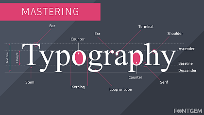
Another great use of varying typography would be with spacing. Typography isn’t just about your letters, it's how they work with one another. Those who work in design will understand what kerning and tracking are. This essentially means that you are using a variation of spacing within your text. If the appropriate spacing is used, it can help make the text less cluttered, despite how it is displayed.
Picking The Right Typography
Picking the right typography is essential and it is something where designers can lose a lot of time when they are designing something using online tools. Whether that is a brand name or logo, designers can seriously fixate on having the right typography just so it stands out and communicates the right message. The typography will communicate a brand's context so it must be right.
Getting typography right is important but it can be difficult. When a new brand is starting their business, they will focus a lot on typography. They may even change it every now and again because their initial message has changed.
Typography is used in many things such as homeware decor. Home prints can often use various typography and these can also make the most perfect homeware gifts. The only issue with that is you need to understand the person's home decor to ensure you are choosing the right typography that works with their interior design.


