The Fundamentals of Typography: Exploring the Key Elements
Let us embark on a comprehensive journey through the core principles of typography, shedding light on the intricate art of arranging type. We delve deep into the essential elements that shape typography, providing valuable insights and understanding of how typefaces, letterforms, spacing, and more come together to create effective and visually engaging communication.
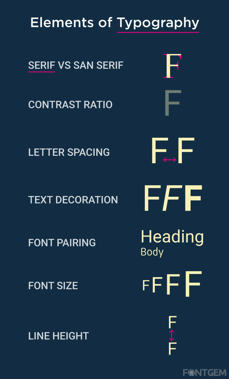
Serif vs. Sans Serif in Typography: Understanding the Difference
Typography is an integral aspect of design and communication, influencing how we perceive and interact with written content. Two primary font categories that play a pivotal role in typography are serifs and sans serifs. These distinct styles have their own unique characteristics and applications, making them essential considerations for designers and typographers.
Serif Fonts
Serif fonts are characterized by small decorative strokes or tails at the ends of the letterforms. These embellishments, known as serifs, create a classic and timeless appearance. Serif fonts are often associated with tradition, authority, and formality. They are commonly used in print media such as newspapers, books, and magazines due to their readability and legibility in long passages of text. Examples of popular serif fonts include Times New Roman, Georgia, and Baskerville.
The serifs on these fonts guide the reader's eye along the text, making it easier to follow the lines of text. They are especially effective in print media where the high resolution enhances the crispness of serifs.
Sans Serif Fonts
In contrast, sans serif fonts lack the decorative strokes at the ends of letterforms. The term "sans" itself means "without" in French. Sans serif fonts exude a modern, clean, and minimalist aesthetic. They are often used in digital interfaces, web design, signage, and branding because of their simplicity and legibility, particularly at smaller sizes or on screens. Prominent sans serif fonts include Helvetica, Arial, and Futura.
Sans serif fonts are favoured in digital and screen-based applications due to their clean lines and readability on various devices and resolutions. They have a straightforward, contemporary feel that aligns well with modern design principles.

Choosing Between Serif and Sans Serif
The choice between serif and sans-serif fonts depends on several factors, including the medium, audience, and design objectives. For printed materials, such as formal invitations or academic papers, serif fonts like Times New Roman or Garamond may be a better choice. In contrast, for digital platforms or designs targeting a younger audience, sans-serif fonts like Arial or Helvetica may be more appropriate. Sometimes, designers also opt for a combination of both serif and sans-serif fonts within the same design to create visual contrast and hierarchy.
For example, using a serif font for headings and a sans-serif font for body text can strike a balance between tradition and modernity. In the end, the choice between serif and sans-serif fonts is a design decision that should align with your project's goals and aesthetics. It's essential to consider readability, context, and the emotional response you want to evoke in your audience when making this typography choice.
Colour Contrast Ratio in Typography: Enhancing Readability and Accessibility
Typography is not just about choosing beautiful fonts; it's also about making content accessible and readable. One crucial aspect of this is the contrast ratio. In typography, the colour contrast ratio refers to the difference in luminance between the text and its background. It plays a significant role in ensuring that text is legible and can be read comfortably by all users, including those with visual impairments.
The Importance of Contrast Ratio
Contrast ratio is a vital element in typography for several reasons:
-
Readability: A good contrast ratio enhances the readability of text. When there's enough contrast between the letters and the background, it becomes easier for the eyes to distinguish individual characters.
-
Accessibility: High contrast is essential for ensuring that content is accessible to everyone, including individuals with various visual impairments. Websites and documents that adhere to accessibility guidelines often have minimum contrast ratio requirements.
-
User Experience: Poor contrast can lead to eyestrain and fatigue, negatively impacting the user experience. Content with adequate contrast is more user-friendly.
Measuring Contrast Ratio
The contrast ratio is typically measured using the formula:
Contrast Ratio = (L1 + 0.05) / (L2 + 0.05)Where:
- L1 is the relative luminance of the lighter text or element.
- L2 is the relative luminance of the darker background.
The resulting ratio falls between 1 (no contrast) and 21 (maximum contrast).
Accessibility Standards
To ensure that text is accessible, it's important to follow established guidelines. The Web Content Accessibility Guidelines (WCAG) provide specific recommendations for contrast ratios. For standard text (less than 18pt or 14pt in bold), the minimum contrast ratio should be 4.5:1. For larger text or important elements, it should be 3:1.

Design Considerations
When working with contrast ratios in typography, consider the following design tips:
-
Colour Choices: Select text and background colours that provide sufficient contrast. High-contrast pairs like black text on a white background are a safe choice.
-
Font Weight: In cases where colour contrast isn't enough, consider using different font weights (e.g., bold) to improve readability.
-
Testing: Utilize contrast-checking tools and accessibility checkers to verify that your design meets the recommended contrast ratios.
-
User Feedback: Collect feedback from users, especially those with visual impairments, to ensure that your typography choices are effective.
To wrap up, the contrast ratio between serif and sans-serif fonts hinges on context, audience, and design objectives. Serif fonts bring tradition and elegance to print, while sans-serif fonts offer a modern, clean look for digital content. Careful consideration of the medium and intended message is crucial when deciding on the right font style. Both font types have their strengths and should align with overall design goals while considering accessibility and readability.
Letter Spacing in Typography: A Crucial Design Element
In typography, letter spacing, also known as tracking or kerning, refers to the adjustment of the space between characters in a text. It is a subtle yet impactful design element that plays a crucial role in shaping the overall appearance and readability of written content.
Kerning vs. Tracking
Before delving deeper into letter spacing, it's important to understand the distinction between kerning and tracking:
-
Kerning: Kerning is the adjustment of the space between two individual characters or letter pairs. It's used to optimize the visual harmony between specific character combinations, such as "AV" or "To."
-
Tracking: Tracking, on the other hand, refers to the uniform adjustment of spacing between all characters in a block of text. It affects the overall density and readability of the text.
The Impact of Letter Spacing
Properly adjusted letter spacing can have a profound effect on the aesthetics and legibility of typography:
-
Readability: The right letter spacing can significantly enhance text readability. Too much spacing can cause words to break apart, while too little can make them appear cramped and challenging to read.
-
Aesthetics: Letter spacing is a critical aspect of font design. It can contribute to the overall visual appeal of a typeface, making it appear balanced and harmonious.
-
Branding and Style: Letter spacing choices can help establish a brand's unique typographic style. For instance, luxury brands might use tighter letter spacing to create a sophisticated and compact appearance, while others may opt for more open spacing for a friendly and approachable feel.
-
Optical Adjustments: Sometimes, letter spacing needs to be adjusted slightly to counteract optical illusions. For example, the letter "T" often appears wider than the letter "I," so designers may reduce the space around "I" to make it appear more balanced.

Considerations for Letter Spacing
When working with letter spacing in typography, consider the following:
-
Typeface Choice: Different typefaces require different levels of letter spacing. Script fonts may need tighter tracking, while sans-serif fonts often benefit from a more open approach.
-
Context: Consider the medium in which the text will be displayed. Digital screens may require different letter spacing than print materials to ensure readability.
-
Legibility: Always prioritize legibility over aesthetics. While adjusting letter spacing can enhance the visual appeal, it should never compromise the readability of the text.
-
Consistency: Maintain consistency in letter spacing throughout a document or design to create a cohesive and polished look.
Text Decoration in Typography: Adding Style and Emphasis
Text decoration is a fundamental aspect of typography, the art and technique of arranging and presenting written language in a visually appealing and readable manner. It involves adding various design elements to text to convey emphasis, hierarchy, or to simply enhance the overall visual appeal of a piece of content. Text decoration plays a crucial role in graphic design, web design, print media, and various other forms of communication.

Here are some key aspects of text decoration in typography:
-
Underlining: One of the most basic forms of text decoration is underlining. When a line is drawn beneath a word or phrase, it is typically used to indicate emphasis or importance. In digital typography, underlining has somewhat fallen out of favour because it can be confused with hyperlinks in web design. Instead, designers often use bold or italics for emphasis.
-
Bold and Italics: Making text bold or italicized is a common way to add emphasis and hierarchy to content. Bold text is often used for headings, subheadings, and important keywords, while italics can be used for titles of books, and magazines, or to emphasize a particular word or phrase within a sentence.
-
Strikethrough: Text with a strikethrough line through it is used to indicate that the text has been deleted or is no longer relevant. In some cases, it can also be used for a humorous or ironic effect, especially in digital communication.
-
Superscript and Subscript: These are used for positioning text above (superscript) or below (subscript) the baseline of the regular text. Superscripts are commonly used for footnotes, references, or mathematical exponents, while subscripts are used in chemical formulas and other scientific notations.
-
Small Caps: Small caps are a style where uppercase letters are presented in a smaller size, similar to the height of lowercase letters. This can create a distinctive and sophisticated look, often used in headings and titles.
-
Text Shadow: Adding a shadow behind text can make it stand out and give it depth. It's a popular technique in graphic design and web design to create visually appealing text effects.
-
Colour: Changing the colour of the text is another way to add emphasis or style. Colour choices can convey different moods, create contrast, or highlight specific information.
-
Decorative Elements: Some decorative elements, such as ornamental borders, flourishes, or drop caps, can be added to the text to enhance its aesthetic appeal, especially in printed materials like books and invitations.
-
Letter Spacing and Kerning: Adjusting the space between letters (letter spacing) and pairs of letters (kerning) can greatly impact the readability and visual harmony of text. Proper kerning is essential for achieving a polished and professional typographic appearance.
-
Text Effects: With advancements in digital typography, designers have access to various text effects like 3D, gradient fills, and more, allowing for creative and eye-catching text treatments.
Effective text-decoration is about finding the right balance between enhancing visual appeal and maintaining readability. Overly decorative text can distract from the content's message, so designers need to exercise restraint and choose text decorations that complement the overall design and purpose of the text. Typography, including text decoration, is a powerful tool for conveying meaning, tone, and style in both print and digital media.
Font Pairing in Typography: Creating Harmonious Combinations
Font pairing is the art of selecting and combining different typefaces to create visually pleasing and harmonious typography. It's a crucial aspect of design that greatly influences the overall look and readability of text. Here are some key points to consider:
1. Establishing Contrast: Font pairing often involves combining fonts with contrasting characteristics. This contrast can be in terms of style, weight, or structure. For example, pairing a bold, sans-serif headline font with a delicate, serif body text font creates a striking contrast that adds visual interest.
2. Enhancing Readability: Effective font pairing takes into account readability. The chosen fonts should be legible and easy to read, even in different sizes. Ensure that the combination maintains clarity and does not compromise the content's accessibility.
3. Maintaining Consistency: While contrast is essential, it's equally important to maintain consistency within your typography. This means selecting fonts that complement each other and share some visual harmony. Consistency helps convey a unified and professional look.
4. Considering the Mood and Message: Different fonts evoke various emotions and convey different messages. For instance, a playful script font may not be suitable for a formal business document. Consider the context and message of your design when choosing fonts to ensure they align with the intended tone.
5. Limiting Choices: While there's a vast array of fonts available, it's best to limit your font choices to a few well-paired options. Too many fonts in a single design can lead to confusion and a cluttered appearance.
6. Test and Refine: Before finalizing font pairings, it's essential to test them in the actual design context. Pay attention to spacing, hierarchy, and overall aesthetics. Be prepared to make adjustments as needed to achieve the desired outcome.
7. Utilizing Resources: Many typography resources and tools are available online to help you explore and experiment with font pairings. These resources can offer suggestions and pair fonts that work well together.

Font pairing in typography is a skill that balances contrast and consistency to create visually appealing and readable designs. By understanding the principles of contrast, readability, and harmony, designers can select and combine fonts that effectively convey their intended message and style.
Typography and Font Size: Striking the Right Balance
Typography, the art of arranging type, isn't solely about choosing the most aesthetically pleasing fonts. A crucial aspect of typography is determining the ideal font size. This element plays a pivotal role in shaping how text is perceived, its legibility, and its visual impact. Here are some vital considerations when delving into the realm of font size:
1. Readability and Comfort: The primary concern when selecting a font size is to ensure that the text remains comfortably readable. Text that's too small can be a strain on the eyes, while excessively large text might overwhelm the reader. Striking the right balance between these extremes is paramount.
2. Establishing Hierarchy: Font size is instrumental in creating hierarchy within a text. It's the difference between a heading that demands attention and body text that gently guides the reader. Larger sizes for headings and smaller sizes for body text help organize information effectively.
3. Content and Medium: The content's nature and the medium of presentation are guiding stars when choosing font sizes. Printed materials like books or newspapers often adhere to standard body text sizes. Conversely, digital media and websites may necessitate larger fonts to accommodate various screens and viewing distances.
4. The Harmony of Consistency: Maintaining consistency in font size throughout a document or design is the key to a polished and cohesive visual style. Consistency guides the reader's experience and fosters a coherent aesthetic.
5. Accessibility for All: In an inclusive design approach, the needs of all readers, including those with visual impairments, are paramount. Adhering to accessibility guidelines, such as ensuring text remains legible when magnified to 200%, is fundamental for creating content that reaches a broad audience.
6. Emphasis and Distinction: Font size serves as a powerful tool for creating emphasis and contrast. Larger text sizes can accentuate vital points or draw attention to specific elements, while smaller text can be used for less prominent information, creating a nuanced visual hierarchy.
7. The Art of Iteration: Finding the perfect font size often requires experimentation. Testing different sizes on various devices and with representative users can refine font size choices and lead to a more effective typographic design.
8. Adapting to the Digital Age: In the realm of responsive web design, font size must gracefully adapt to diverse screen sizes and orientations. Utilizing relative units like percentages or ems, rather than fixed pixel sizes, ensures text remains legible across a spectrum of devices.

Font size in typography is an essential element, bridging the gap between readability and visual allure. Designers must navigate the waters of context, audience, and medium to select font sizes that produce typography that's not just eye-catching but effectively communicates its intended message. Balancing legibility with visual impact is the linchpin of successful typographic design.
Line Height in Typography: The Space Between
Line height, often referred to as leading, is the vertical space between lines of text. It's a critical element in typography with several key considerations:
-
Readability and Comfort: Appropriate line height enhances text readability by providing enough space between lines. Too little space can make text feel cramped and challenging to read, while too much space can disrupt the flow.
-
Impact on Aesthetics: Line height affects the overall visual appeal of a block of text. It can contribute to a design's harmony and balance, making it more inviting to readers.
-
Accessibility: Ensuring adequate line height is crucial for accessibility, as it benefits individuals with visual impairments. It allows text to be legible and comprehensible, even when viewed at larger sizes.
-
Optimal Line Spacing: The ideal line height depends on various factors, including font choice, font size, and the medium of presentation. Finding the right balance ensures text is both legible and visually pleasing.
-
Responsive Design: In responsive web design, line height must adapt to different screen sizes and orientations. Using relative units like percentages or ems helps maintain consistent line spacing across various devices.
-
Hierarchy and Visual Impact: Adjusting line height can also play a role in establishing text hierarchy. For instance, headings may have tighter line spacing to make them stand out, while body text benefits from more generous line height for readability.

Line height in typography is a crucial factor influencing both the readability and aesthetics of text. Striking the right balance ensures that written content not only looks visually pleasing but is also accessible and easy to read, catering to a diverse audience.


