The Best Fonts for Website Accessibility
When it comes to designing a website, there are many things to consider. One of the most important aspects is the font choice. Fonts not only affect the look and feel of your website, but they also impact its accessibility.
Let's take a look at the best fonts for website accessibility and explain why font choice is so important.
Why Font Choice Matters for Accessibility
Font choice is a critical aspect of website accessibility. For many users, the font you choose can make the difference between a website that is easy to use and one that is difficult to navigate. Accessibility guidelines for font size and style have been established to help website designers make the best choices for their users.
Accessibility Guidelines for Font Size and Style
According to the Web Content Accessibility Guidelines (WCAG), the text should be presented in a way that is easy to read and understand. This means that font size, style, and colour should be carefully chosen.
The guidelines recommend a minimum font size of 16px and a maximum line length of 80 characters. Serif and sans-serif fonts are both acceptable, as long as they are easy to read.
The Best Fonts for Accessibility
Serif vs. Sans Serif
When it comes to choosing a font for your website, you may wonder whether serif or sans-serif fonts are better for accessibility. The truth is that both can be effective, as long as they are used correctly.
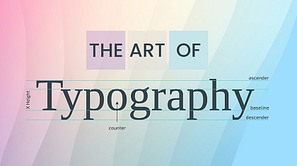
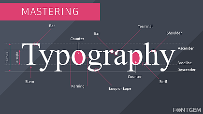
Serif fonts, which have small lines at the ends of each stroke, can be easier to read for some users. Sans-serif fonts, which lack these lines, can be better for users with visual impairments.
Large Font Sizes
Another key aspect of font accessibility is size. The larger the font, the easier it is to read. A font size of at least 16px is recommended for body text, and larger sizes may be necessary for headings and other important elements.
High Contrast
High contrast between the text and background can also make a significant difference in accessibility. A high contrast ratio makes it easier for users with visual impairments to read the text. The WCAG recommends a minimum contrast ratio of 4.5:1 for normal text and 3:1 for large text.
Font Styles to Avoid
Some font styles can make the text more difficult to read, particularly for users with visual impairments. Avoid fonts with thin strokes, condensed or compressed fonts, and decorative or script fonts. These styles can be hard to read, especially at smaller sizes.
Tools to Test Font Accessibility
There are many tools available to help you test the accessibility of your font choices. These tools can help you determine whether your font is easy to read for users with visual impairments and whether it meets WCAG guidelines.
Some popular tools include Color Contrast Analyzer, WebAIM's Contrast Checker, and Accessible Colors.
Sans-serif fonts
Sans-serif fonts are those without the small projecting features called "serifs" at the end of strokes. They are often used for digital designs and modern websites because they have a clean and straightforward appearance, which is easy to read even in smaller sizes.
Some of the most popular sans-serif fonts for accessibility include:
• Arial: This is a widely used font with a straightforward and readable design that works well for web content.
• Open Sans: This font has an open, clear, and easy-to-read design that is ideal for mobile devices and smaller screens.
• Roboto: This font is specifically designed for digital interfaces and has a simple, modern look that is easy to read on any device.
• Verdana: This font was specifically designed to be legible in smaller sizes, making it ideal for web content.
• Helvetica: This font has been around for decades and is still one of the most popular choices for digital designs.
Serif fonts
Serif fonts are those with small projecting features called "serifs" at the end of strokes. They are often used for print designs and can give a classic, elegant feel to website designs. However, not all serif fonts are suitable for web content, and some can be challenging to read, especially in smaller sizes.
Here are some of the best serif fonts for website accessibility:
• Georgia: This font was specifically designed for screen readability, making it an excellent choice for web content.
• Times New Roman: This font has been around for decades and is still one of the most popular serif fonts for print and digital designs.
• Cambria: This font has a classic look and is easy to read on both print and digital designs.
• Garamond: This font has a timeless, elegant design that is ideal for web content and print designs.
• Baskerville: This font has a sophisticated and classic look, making it an excellent choice for elegant designs.
Choosing the right fonts for your website is essential to ensure that your content is accessible and easy to read for all users, regardless of their abilities.
By following the best practices outlined in this article and using the recommended fonts, you can improve the readability and accessibility of your website's content.
Remember to consider factors such as font size, style, and colour contrast when selecting fonts for your website to ensure that all users can enjoy your content.


