Anatomy of Typography: A Comprehensive Guide to Mastering Typography
Typography is the art of visual communication through written words, impacting how information is perceived and understood in design. This exploration delves into its intricacies, styles, and applications for a deeper understanding.
Typography is crucial in graphic design, web design, branding, and print media, encompassing font choice, text arrangement, spacing, and hierarchy to convey messages effectively. Whether you're a designer, marketer, or interested in visual communication, mastering typography enhances your work.
1. Typeface Categories
Typography, the art of text arrangement and design, involves various typefaces, each with unique uses. To navigate this, grasp the primary typeface categories, forming the basis for typographic choices. These categories are:
Serif Typefaces
Serif typefaces are distinguished by small decorative strokes or "serifs" at the ends of letterforms. They embody a sense of tradition, formality, and timelessness. Notable examples of serif typefaces include Times New Roman, Georgia, and Baskerville.

Sans-Serif Typefaces
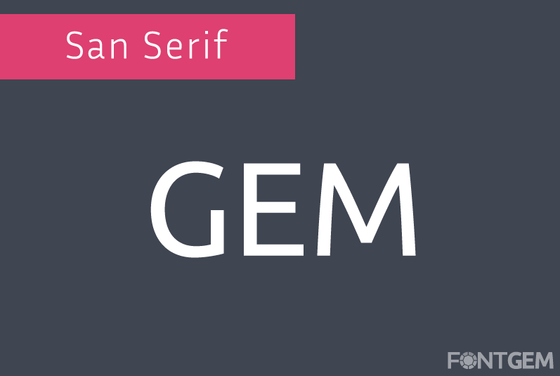
In contrast to serif fonts, sans-serif typefaces omit decorative serifs. They embrace a modern, clean, and minimalist appearance, making them well-suited for various contemporary design contexts. Prominent sans-serif typefaces include Helvetica, Arial, and Futura.
Script Typefaces
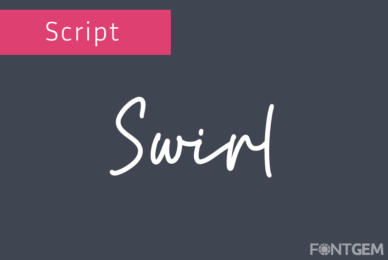
Script typefaces aim to replicate the fluidity and charm of handwriting and cursive writing styles. They inject a sense of elegance, creativity, and personalization into designs. Notable script typefaces include Brush Script, Edwardian Script, and Lobster.
Display Typefaces
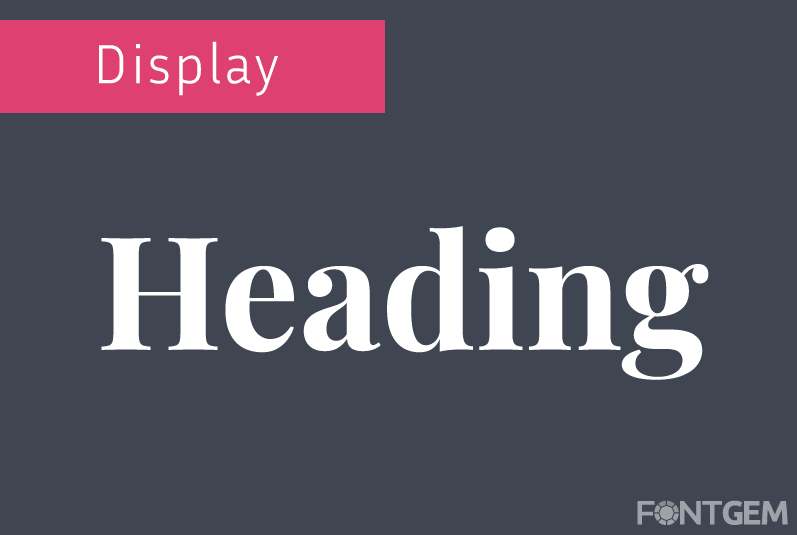
Display typefaces, characterized by their high level of decoration and visual impact, are typically reserved for headlines, titles, and other prominent design elements. While they can captivate attention, it's essential to use them judiciously. Examples of display typefaces include Impact, Blackletter, and Comic Sans (though the latter is generally discouraged for professional use).
Monospaced Typefaces
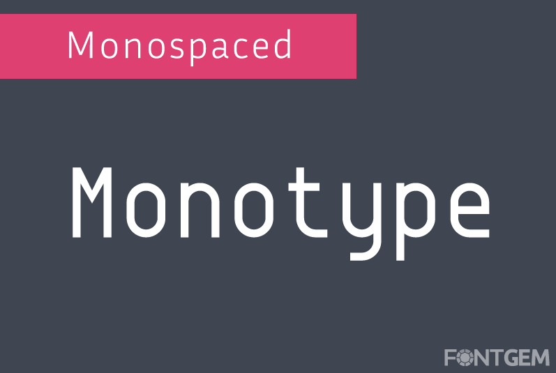
Monospaced typefaces allocate equal horizontal space to each character, resulting in a uniform appearance. They find common applications in coding, and typewriters, and evoke a technical or retro aesthetic. Courier New and Consolas are well-known monospaced typefaces.
Understanding these typeface categories provides a solid framework for selecting the right typeface for specific design objectives. Each category evokes distinct feelings and associations, making context and project goals pivotal considerations in the decision-making process.
2. Typeface Styles
Beyond typeface categories, there exist various styles within each category, exerting a profound influence on the mood and readability of text. These styles offer an extensive palette for typographic expression:
Italic
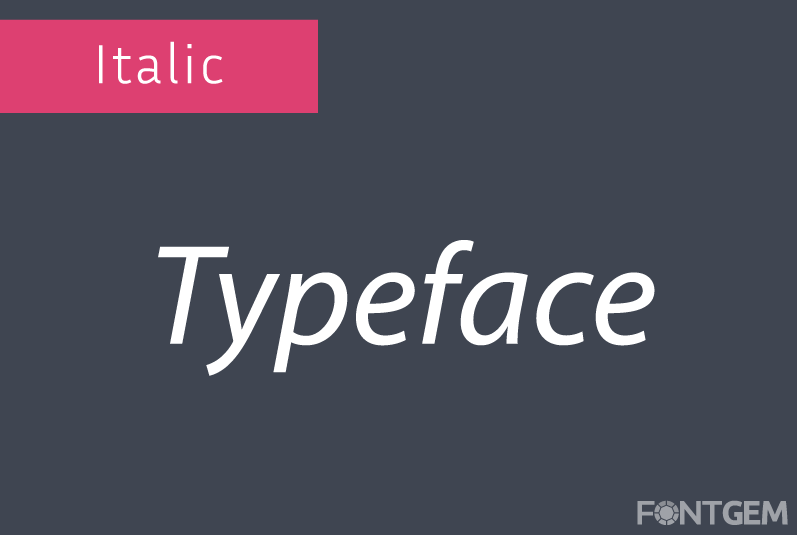
Italic typefaces introduce slanted and stylized versions of regular characters. They are frequently employed for emphasis or to signify foreign words or phrases. Italics convey a sense of elegance and informality.
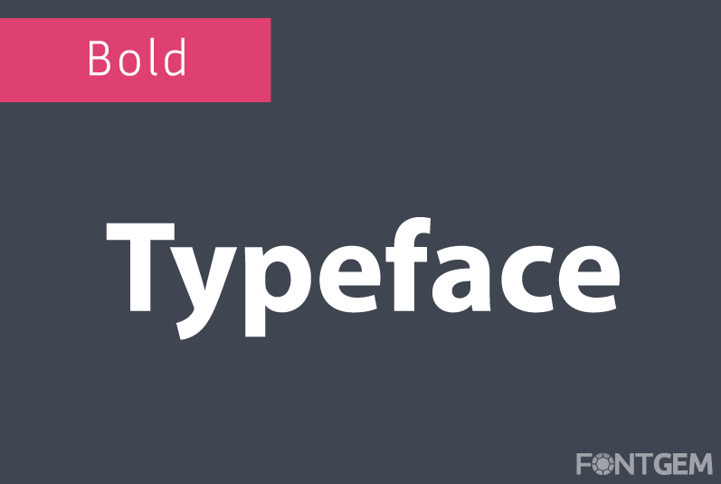
Bold
Bold typefaces feature thicker and more pronounced strokes. They serve as a means of emphasizing headings, subheadings, and crucial text. Bold typefaces inject weight and visual impact into the content.
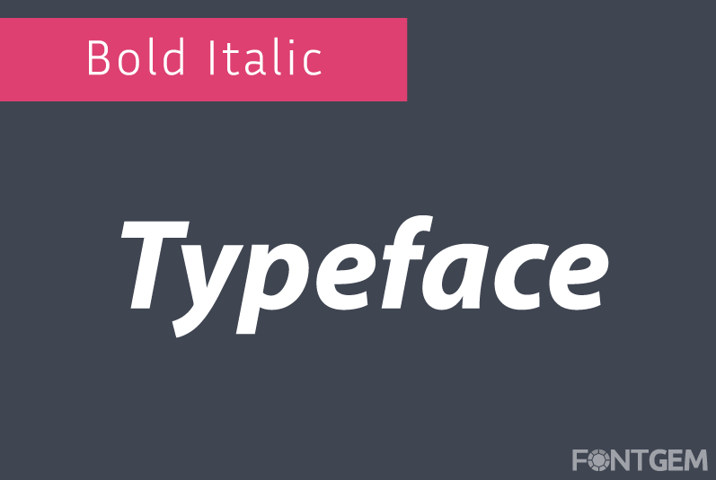
Bold Italic
Bold italic typefaces amalgamate the attributes of both bold and italic styles. This versatile style can be deployed for emphasis or to introduce stylistic variations within the text.
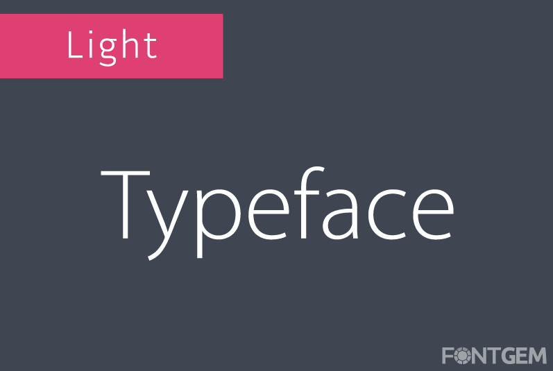
Light
Light typefaces are characterized by thinner strokes, imparting a delicate and airy aesthetic. They excel in conveying subtlety and refinement.
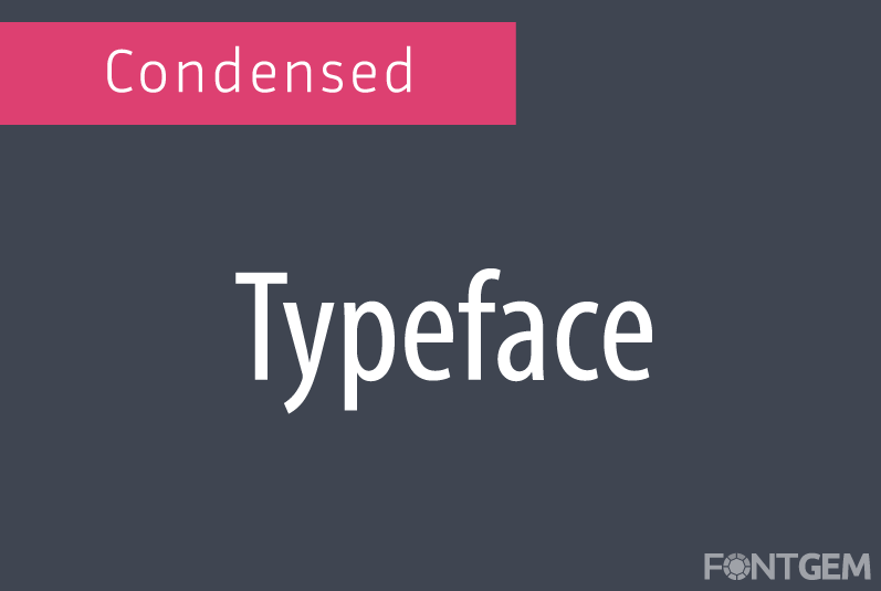
Condensed
Condensed typefaces possess narrower letterforms, enabling more text to fit within confined spaces. They often grace newspaper headlines and posters, maximizing content within limited dimensions.
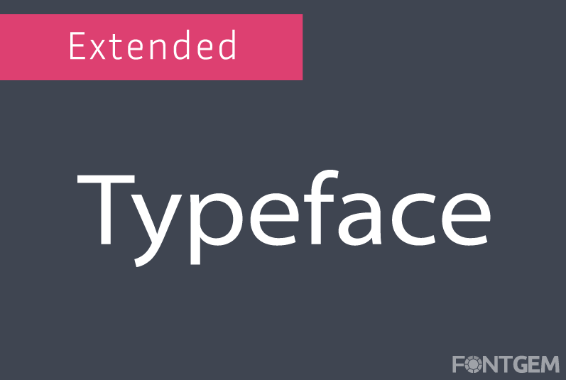
Extended
On the opposite end of the spectrum, extended typefaces showcase wider letterforms, creating a bold and expansive visual impact. They communicate strength and stability effectively.
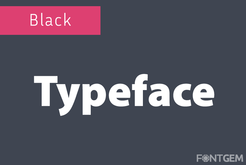
Black
Black typefaces boast the heaviest and boldest strokes, ensuring high visibility and attention-grabbing qualities. They are frequently enlisted for impactful headlines and titles.
Comprehending these typeface styles empowers designers to wield typography as a potent tool for conveying nuanced messages and achieving aesthetic goals. Typography, with its diverse categories and styles, is a dynamic means of visual communication.
We will delve deeper into the anatomy of typefaces and explore the precise metrics that govern effective typography. Our journey through the realm of typography continues, where every letter and style narrates a distinctive story.
3. Typography Elements
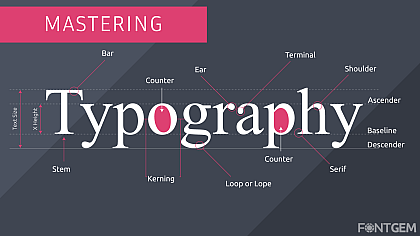
To master typography, begin with the basics: the building blocks of letterforms. Here, we explore typography's anatomy, dissecting letters into essential elements that shape text's appearance and legibility. Designers and typographers must grasp these nuances.
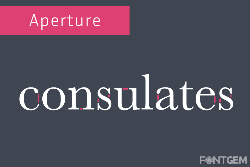
Aperture
The aperture refers to the partially enclosed, somewhat rounded negative space within certain characters, such as 'e' and 'c'. It greatly affects the readability and overall aesthetic of a typeface.
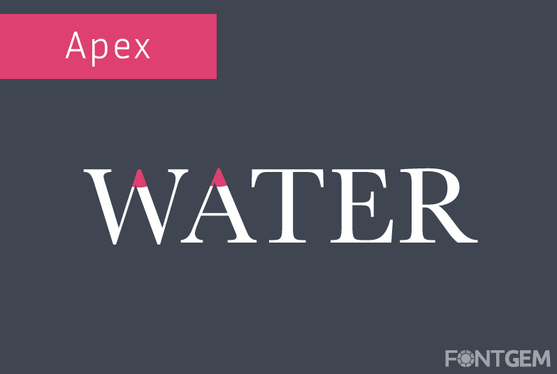
Apex
The apex is the topmost point of characters with diagonal strokes, like 'A' and 'W'. Its position and curvature can significantly impact the visual balance of a typeface.
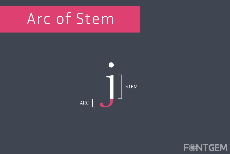
Arc of Stem
The arc of the stem is the curved portion of a character's main vertical stroke, like the lower part 'j'. The curvature can vary in different typefaces, influencing their overall style.
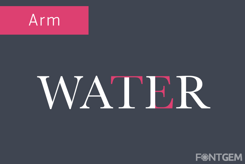
Arm
Arms are horizontal strokes that do not connect to a stem or other part of a character, such as the top of 'E' or 'F'. The length and angle of arms contribute to a typeface's uniqueness.
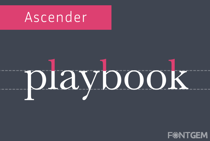
Ascender
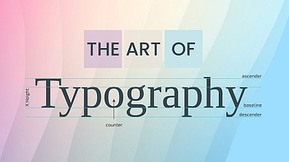
Ascenders are the parts of certain characters, like 'b' and 'h' that extend above the x-height, contributing to the vertical rhythm of a typeface.
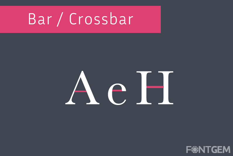
Bar / Crossbar
The bar or crossbar is a horizontal stroke that connects two stems in characters like 'A', 'H' or 't'. Its position, thickness, and angle influence the overall appearance of the typeface.
Bowl
The bowl is the rounded, enclosed part of characters like 'b' and 'd'. Its shape and proportions contribute to a typeface's legibility and style.

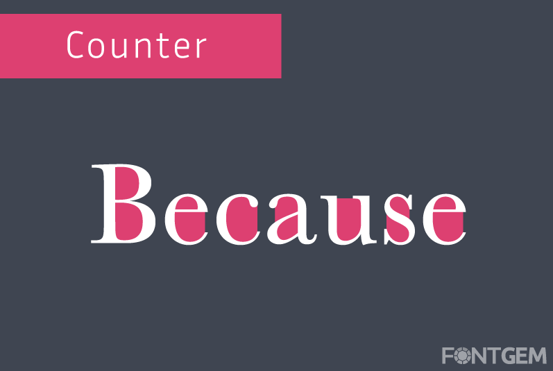
Counter
The counter is the fully or partially enclosed space within characters like 'o' and 'e'. The size and shape of counters are critical for character recognition.
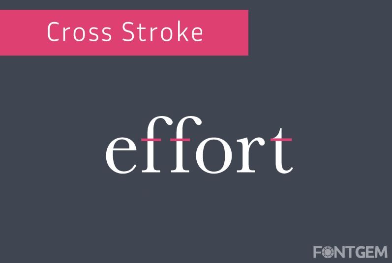
Cross Stroke
Cross strokes are horizontal strokes that intersect the stem of characters like 't' and 'f'. Their length and position affect the character's balance and legibility.
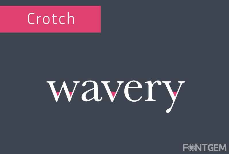
Crotch
The crotch refers to the point where two diagonal strokes meet in characters like 'V' and 'W'. Its angle and curvature influence the character's overall shape.
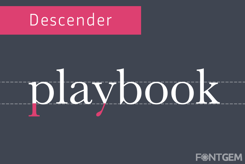
Descender
Descenders are the parts of characters like 'g' and 'y' that extend below the baseline, contributing to the typeface's vertical rhythm and aesthetics.
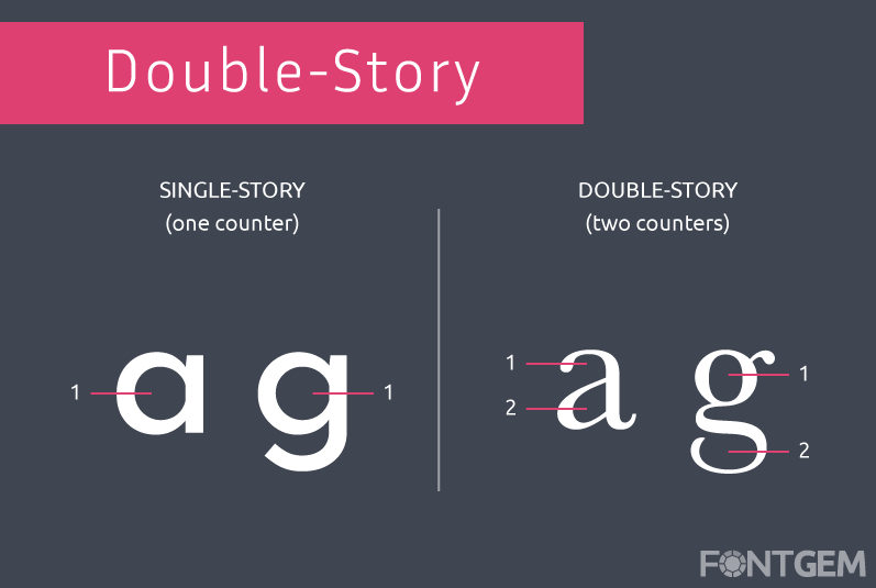
Double-Story
Double-story characters, like 'a' and 'g,' have two distinct parts in their bowls. Understanding their proportions is essential for maintaining consistency within a typeface.
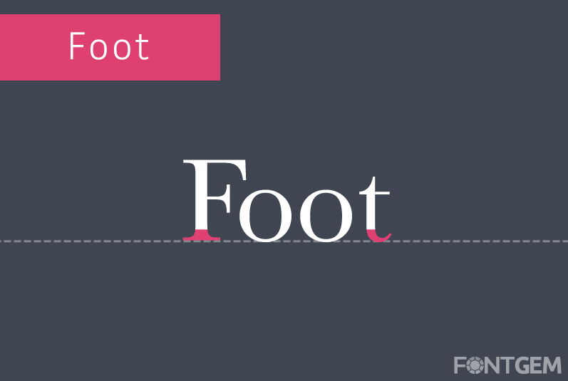
Foot
The foot is the bottommost, often serifed part of characters like 'L' and 'r'. The design of the foot can vary in different typefaces, impacting their style.
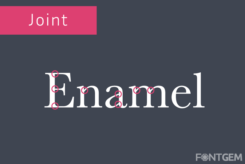
Joint
The joint is the point where two diagonal strokes meet in characters like 'N' and 'M'. Its curvature and angle are essential for character balance.
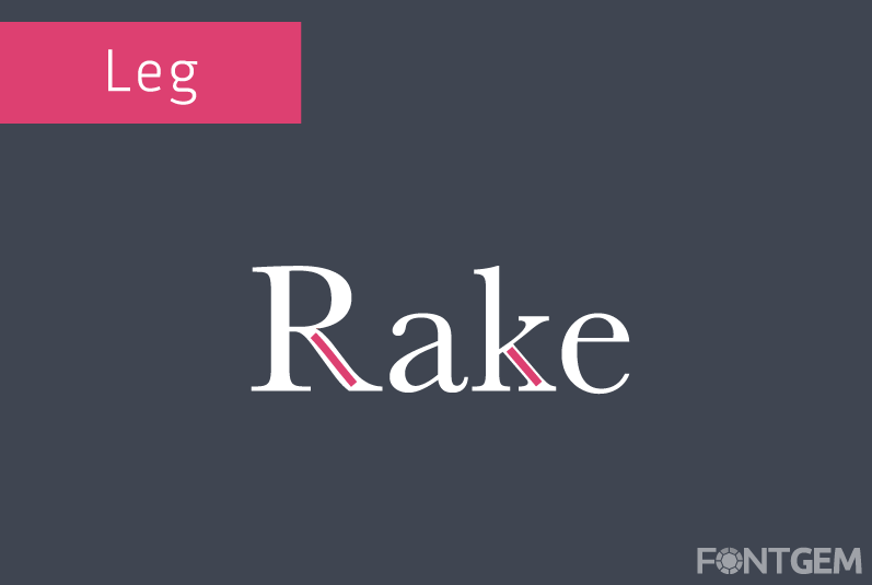
Leg
The leg is a diagonal stroke in characters like 'R' and 'k'. Its length, angle, and curvature influence the character's overall appearance.
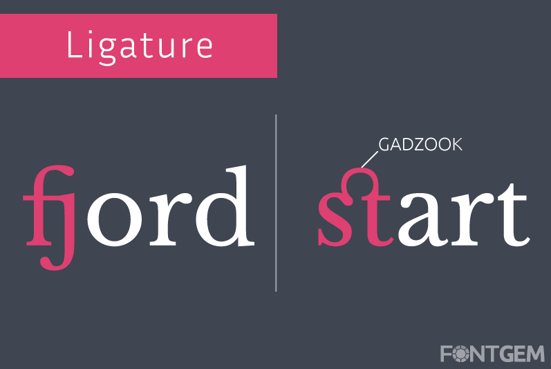
Ligature
Ligatures are combinations of two or more characters that are designed to be joined together for improved aesthetics and legibility. The decorative element linking the two letters is known as a "gadzook".
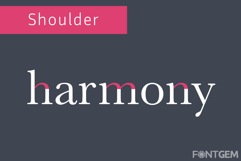
Shoulder
The shoulder is the curved, often serifed, part of characters like 'h' and 'm'. Its design contributes to the typeface's style and elegance.
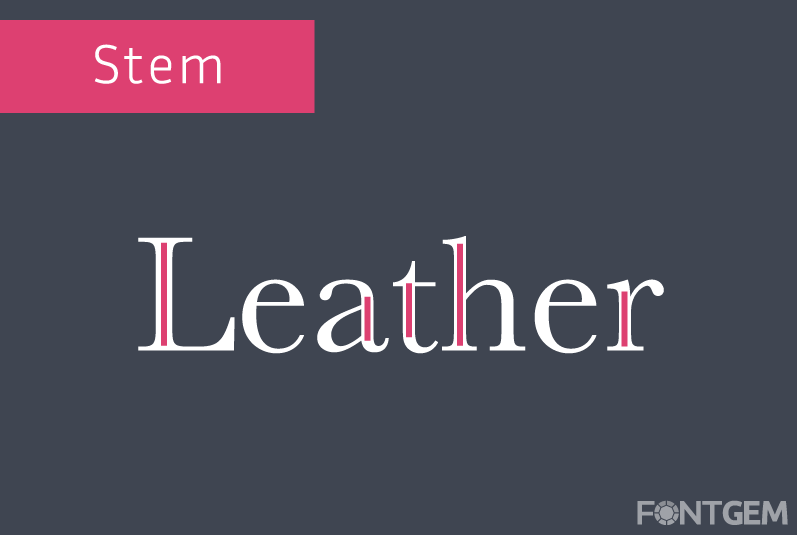
Stem
The stem is the main vertical stroke in characters like 'l' and 'i'. Its thickness, straightness, and positioning greatly affect the typeface's overall look.
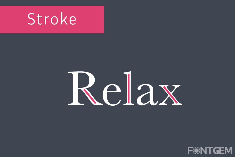
Stroke
Strokes are the main lines that form the basic structure of characters. Understanding their thickness and style is crucial for typeface selection.
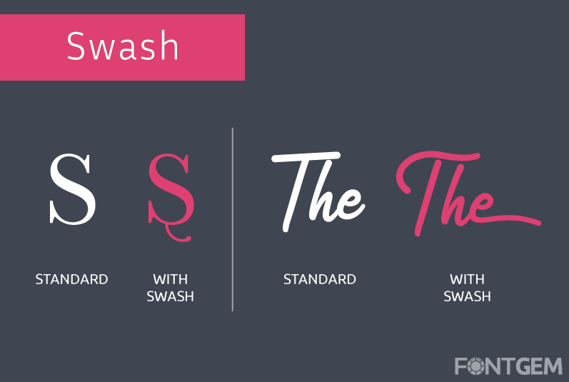
Swash
Swashes are decorative, often exaggerated, extensions of characters' strokes. They are commonly used for ornamental purposes in display typefaces.
Terminal
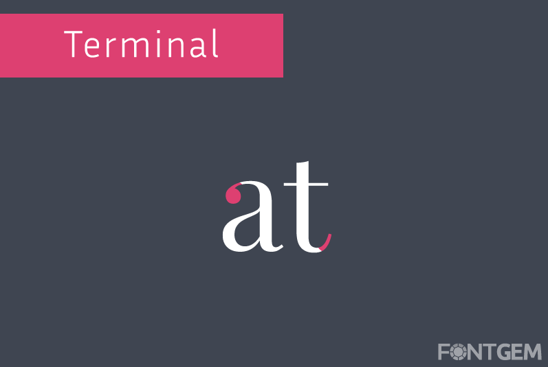
Terminals are the ends of strokes in characters like 'a' and 'f'. It is the endpoint where the stroke concludes, and it can come in various shapes and styles. Terminals can be classified into different types, such as:
-
Serif Terminal: The traditional ending with a small decorative stroke, common in serif typefaces.
-
Ball Terminal: A rounded endpoint, often seen in sans-serif typefaces.
-
Swash or Finial: Elaborate or decorative extensions or flourishes at the end of strokes, adding a touch of ornamental design.
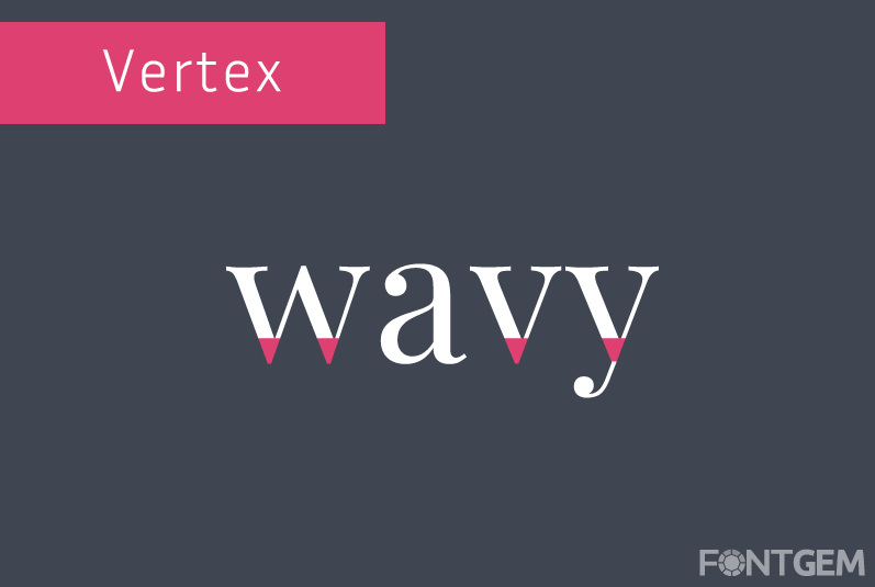
Vertex
The vertex is the point where two strokes meet in characters like 'X' and 'Y'. Its design influences the character's overall shape and balance.
Grasping these elements empowers designers to choose typefaces precisely, distinguishing excellent designs from average ones. Stay with us as we explore font and typeface differences, characters, glyphs, and serif vs. sans-serif styles.
4. Font/Typeface
In the world of typography, the terms "font" and "typeface" are often used interchangeably, but they have distinct meanings that are crucial to understanding the field. We will clarify the difference between fonts and typefaces and explore the significance of this distinction.
Defining Font and Typeface
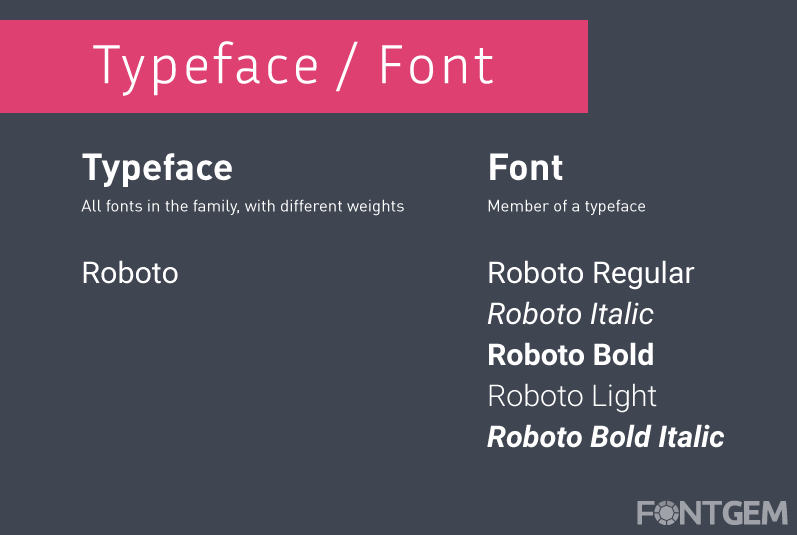
Typeface: A typeface, also known as a font family, refers to a specific design of characters, including letters, numbers, and symbols, that share a consistent visual style. Typeface design encompasses various weights, styles (such as regular, italic, bold, and bold italic), and variations (like condensed or extended). Examples of typefaces include Helvetica, Times New Roman, and Arial.
Font: A font, on the other hand, is a specific instance or variation of a typeface. It is a digital file that contains a set of characters with specific attributes, such as size, weight, and style. For instance, Arial Regular 12pt and Arial Bold Italic 18pt are different fonts within the Arial typeface family.
Significance of the Distinction
Understanding the difference between fonts and typefaces is vital for typographers and designers for several reasons:
-
Clarity in Communication: Precise terminology ensures clear communication when discussing design projects. Designers can convey their intentions accurately to clients and colleagues.
-
Design Flexibility: Recognizing that a typeface can have multiple fonts with different styles and attributes empowers designers to make informed choices to achieve specific visual effects.
-
Licensing and Usage: Font licenses often dictate how fonts can be used and distributed. Understanding the distinction helps users comply with licensing agreements.
-
Consistency: Consistency is key in design. By using the correct font and style within a typeface family, designers maintain visual harmony in their projects.
-
Effective Pairing: When combining typefaces, designers need to select compatible typefaces and fonts to create visually pleasing and readable designs.
In practice, select a typeface, then choose fonts within that family for precise text control, making typography a potent tool for design's meaning and aesthetics.
5. Character and Alternate Character/Glyph
Typography involves working with individual characters, each of which has a distinct design and purpose. Let's explore the concept of characters within typefaces and delve into the intriguing world of alternate characters and glyphs.
Defining Characters in Typography
Characters in typography are individual letters, numbers, symbols, and punctuation marks, each with a unique design and communication role. Understanding character nuances is crucial for typographers and designers, from 'a' to 'Z'.
Exploring Alternate Characters and Glyphs
Beyond the standard characters that we use daily, many typefaces offer alternate characters or glyphs. These are variations of characters that can add diversity and style to text. Here's what you need to know about them:
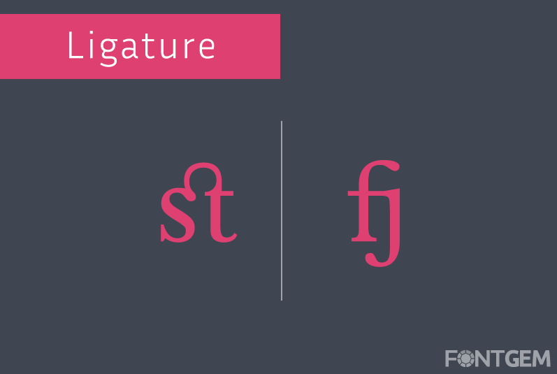
1. Ligatures: Ligatures are a type of alternate character where two or more characters are combined into a single, visually harmonious unit. They are often used to improve the aesthetics and readability of certain character combinations. For example, in some fonts, the letter pair "fi" may be replaced with a ligature that connects the two letters.
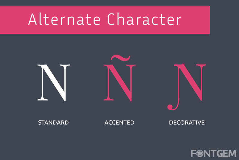
2. Stylistic Alternates: Some typefaces provide alternate versions of specific characters for stylistic purposes. These alternatives can vary in design, offering different looks for characters while maintaining overall readability. Designers often use these alternates to add flair to their typography.
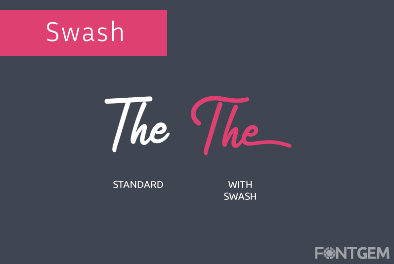
3. Swashes: Swashes are decorative and often extravagant extensions or flourishes added to characters. They are commonly found in script and decorative typefaces and are used to enhance the visual appeal of text, especially in titles and headlines.
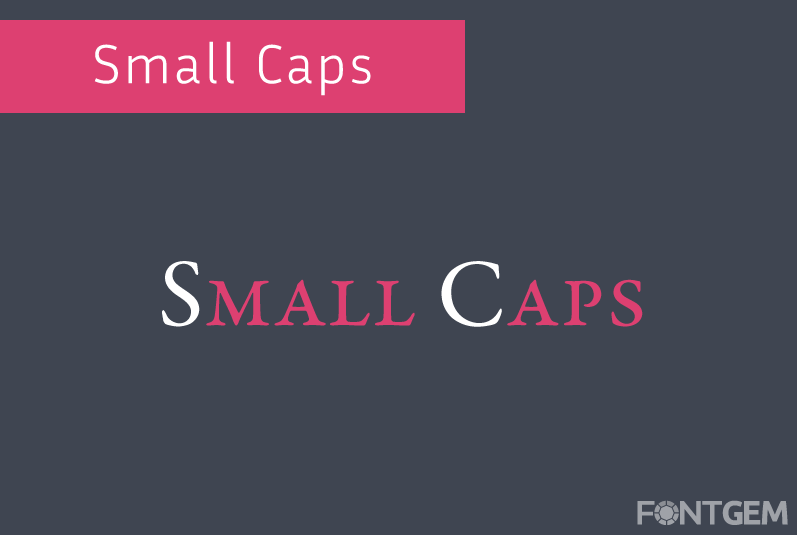
4. Small Caps: Small caps are alternate versions of uppercase characters that are the same height as lowercase characters. They maintain uniformity within a line of text and can be used for emphasis or stylistic consistency.
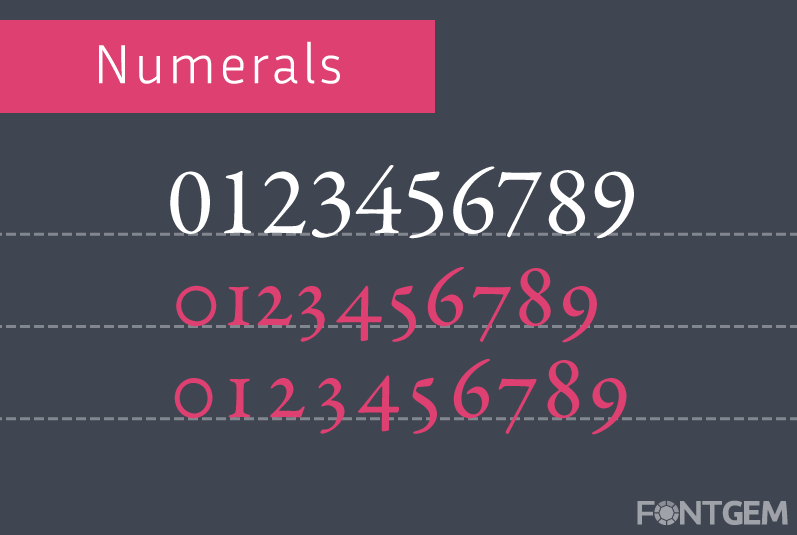
5. Numerals: In some typefaces, you'll find alternative numeral styles, such as old-style figures (proportional and lowercase-like) and lining figures (uppercase-like). The choice of numerals can impact the overall look and feel of numbers in a text.
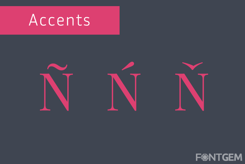
6. Diacritics and Accents: Typefaces designed for multiple languages often include alternate characters with diacritics and accents. These characters ensure proper representation and legibility for a variety of languages.
Understanding and utilizing alternate characters and glyphs allows designers to infuse creativity and uniqueness into their typography. It also offers the opportunity to tailor text to specific contexts and design goals, making the written word even more engaging and visually appealing.
We will now explore the differences between serif and sans-serif typefaces, delve into the characteristics of italic type, and discuss the significance of the baseline, cap line, and x-height in typography. These aspects will further enrich your understanding of typography's intricacies.
6. Baseline, Cap Line, and X-Height
The baseline, cap line, and x-height are fundamental components of typography that play a crucial role in shaping the visual harmony and legibility of text. We'll explore these elements and their significance in typography.
Baseline
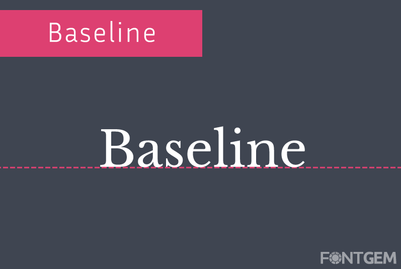
The baseline is an invisible, horizontal line upon which the majority of characters in a typeface rest. It serves as the foundation upon which text is aligned and provides a sense of visual continuity. All characters, whether lowercase or uppercase, align their bottoms with the baseline. The baseline is a fundamental reference point for maintaining the consistency and stability of text in typography.
Cap Line
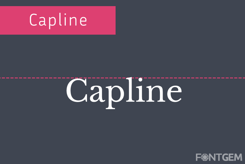
The cap line, also known as the uppercase line or the top line, is another horizontal reference point in typography. It represents the height at which uppercase characters and certain ascenders (parts of characters that extend above the x-height) align. The cap line defines the upper limit for characters like 'A,' 'E,' and 'H,' ensuring uniformity in their positioning.
X-Height
The x-height is the height of the lowercase letter 'x' in a typeface. It is a pivotal measurement because it determines the relative size of all other lowercase characters and affects the overall legibility and appearance of text. The x-height is a key factor in differentiating typefaces and their suitability for specific applications.
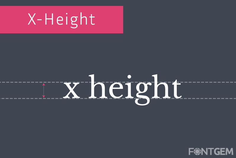
Understanding the interplay between these three elements—baseline, cap line, and x-height—is essential for typographers and designers. It allows for precise alignment, spacing, and proportionality in typography, contributing to the overall aesthetics and readability of text.
9. Typography Metrics
Typography metrics are the precise measurements and adjustments made to text to ensure that it is visually appealing, legible, and well-balanced. Let's take a look at three essential typography metrics: kerning, leading (line-spacing), and tracking (letter-spacing).
Kerning
Kerning fine-tunes character spacing for visual harmony and legibility. Certain letter combinations may create awkward gaps or clashes, so adjusting them manually enhances the overall appearance.

For example, in the word "AVOID," the combination of 'A' and 'V' may require kerning to reduce the space between them, ensuring they don't appear too far apart.
Leading (Line-Spacing)
Leading, pronounced "ledding," refers to the vertical space between lines of text. It is also known as line-spacing. Leading is crucial for legibility and readability, as it determines how comfortable it is for readers to move from one line to the next.

Proper leading ensures that lines of text do not appear too crowded or too far apart. Inadequate leading can make text feel cramped, while excessive leading can disrupt the flow of reading. Designers must strike a balance that suits the typeface, font size, and intended use of the text.
Tracking (Letter-Spacing)
Tracking, also known as letter-spacing, is the adjustment of space between all characters in a block of text. It differs from kerning, which adjusts space between specific character pairs. Tracking affects the overall density and visual balance of the text.
![]()
Increasing tracking adds space between all characters, which can be useful for enhancing readability in small text sizes. Decreasing tracking tightens the spacing, often used for stylistic purposes or in display text.
By mastering kerning, leading, and tracking, designers have precise control over the spacing and arrangement of text. These metrics are essential for achieving both functional and aesthetic goals in typography.
Understanding typography is crucial for anyone involved in design, from graphic artists to web developers. The intricate art of typography, explored comprehensively in this guide, encompasses not just the selection of fonts but the nuanced principles governing their arrangement and application.
Mastery of typography involves a deep understanding of readability, hierarchy, and aesthetic balance, empowering designers to communicate messages effectively through the subtle interplay of letterforms. By delving into the anatomy of typography, practitioners gain the tools to elevate their designs, ensuring clarity, impact, and a lasting impression on their audiences.
